
Prophecy project – Outcome v1
Posted: January 11, 2014 Filed under: Subject Leave a commentThis is a photograph showing the poster designs I had made, which have then been turned into three stencils ready to be used for the prints.

Stencil cut outs
With stenciling I found that it was a very flimsy job and I had to change a lot of the design a lot in order to create it to stay together. You might not be able to work it out from the photograph, but I had to make sure that each cutout was still linked to the main body of the paper otherwise it would have fallen off leaving my text not readable which I really did not like doing. Another thing was that I felt that I had very limited control over the knife which had an effect on the quality on each. As time was getting very close to the end and the print studio was fully booked I felt that I had to just bit the bullet and go for it, so went ahead and printed each poster using a sponge for my final pieces. My chosen colours were to keep each colour limited with the use of only black, white and red to highlight the important ‘hidden messages’ within each poster. Looking back on it I think that was a little silly of me to even think about leaving hidden messages when I have not even got a clear one anywhere on the poster.
Final outcome; (before improvement)

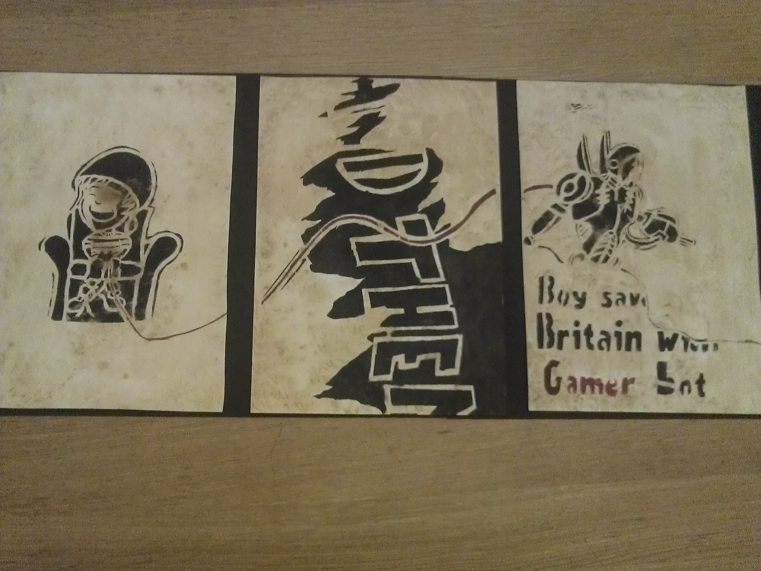
Picture of final outcome V1
The above are the outcomes to the prints I had made while using the stencil approach. Looking over each poster they seemed to all appear very much incomplete and not very interesting to look at which kills the idea of a poster, so thought that I would try and give each poster a vintage old vibe to them and decided to stain each with tea to see what effect it would have had. Results below.
Outcome v2;
Outcome v2
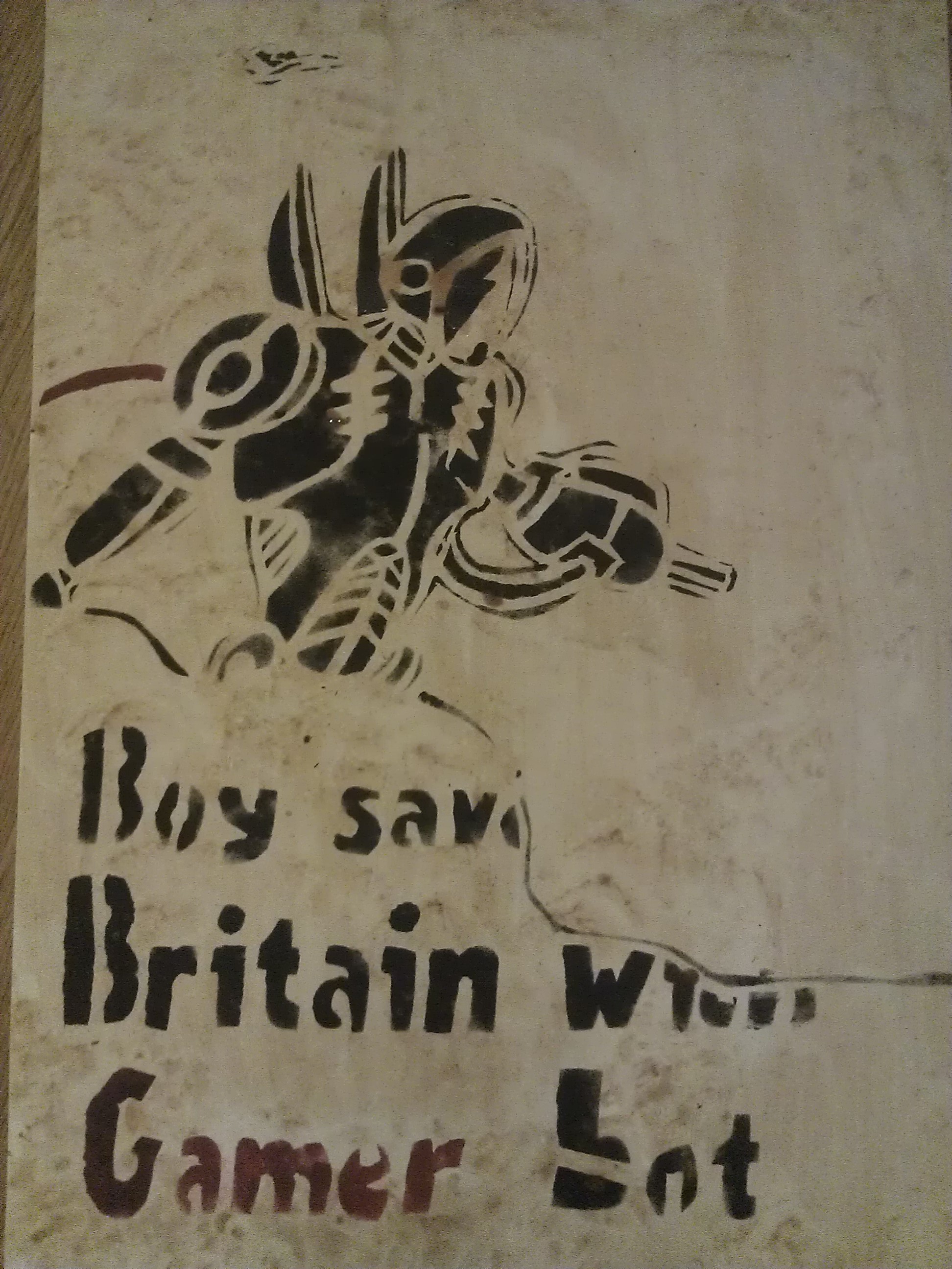
These are now showing the results after I had tea stained each. To be pretty honest with myself and put it blunt, the outcome looks very cheap and tacky. I think that the message I wanted to give off really was not present at all and the stenciling really did not help make it any more clear. I think that another thing which did not go to plan was the tea staining each poster idea, because it only added to it looking very tacky to start with although did bring a little bit of life to the posters. Personally I really think that this project has not gone well at all. I have learned a lot about cartooning and also now see that the idea of using three posters to create one big message did not work at all unless they were each very clear to begin with.
This has been a massive learning curve for me and I think that I should never allow so many mistakes to happen in one go. I think that I need to get a lot more organized with my time keeping and make look into doing each of these posters in a digital format to see if that would have any effect on helping me improve the quality of the posters. I am not very happy with the results but still have learned a lot about things such as stenciling that I want to expand on in future. I would like to try to save this outcome in the future by using a digital format which will allow me to move and play around with each poster in an attempt to save what has gone wrong.

Recent Comments